Apr 5, 2025
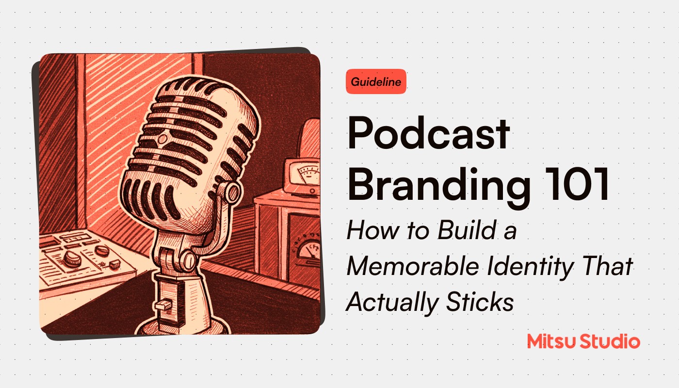
Let's be honest, the podcast landscape is now more crowded than a subway car during rush hour. With over 4.4 million podcasts competing for attention, your brilliant content needs serious backup to stand out. Enter branding: your secret weapon in the audio wars.
Why Your Podcast Branding Actually Matters
Think having good content is enough? Think again. In today's podcast jungle, your branding is what makes listeners stop scrolling and hit play. Strong branding isn't just window dressing, it's your podcast's lifeline:
Creates instant recognition in overcrowded directories
Establishes credibility before the first listen
Attracts your ideal audience (and filters out the rest)
Builds the emotional connection that transforms casual listeners into superfans
Justifies charging premium rates for sponsorships when your numbers grow
Case in Point → "My Favorite Murder" built a rabid fan base (self-proclaimed "Murderinos") through consistent branding. Their signature sign-off "Stay Sexy and Don't Get Murdered" became so iconic it spawned merchandise lines and even a book title. Their instantly recognizable red and black color scheme appears everywhere from their podcast art to their tour merchandise, creating a complete brand ecosystem that fans actively participate in.
Logo: The Face That Launches a Thousand Downloads
Your logo does the heavy lifting in the split second someone decides whether to check out your show. It's not just a pretty picture, it's your podcast's first impression.
What Makes a Killer Podcast Logo:
Bold simplicity that communicates your vibe at a glance
Works at multiple sizes (from Apple Watch to desktop billboard)
Contains visual elements that reflect your content without being literal
Uses distinctive shapes that create a recognizable silhouette
Avoids trends that will make it look dated next year
The Hard Truth: If your logo looks like it could belong to any other podcast in your category, it's not doing its job. Period.
As we’ve seen IRL → "The Daily" from The New York Times uses a minimalist blue square with a simple white "T" that works brilliantly at tiny sizes. It's so distinctive that regular listeners can spot it instantly while scrolling through their podcast app. The simplicity allows it to be instantly recognizable while conveying the journalistic authority of the Times brand. When they promote episodes on social media, that blue square has become visual shorthand for trustworthy news analysis.
Expert Move: Create variations of your logo for different platforms. Your main square logo might need rectangular versions for banners, simplified versions for small displays, and standalone icon versions for favicons.
The Psychology Behind Your Podcast's Color Palette
Colors trigger emotional responses faster than any other branding element. Choose wisely.
Strategic Color Psychology:
Blue inspires trust and authority (perfect for news, business, educational content)
Red triggers excitement and urgency (ideal for motivation, sports, debate)
Green signals growth and balance (natural fit for wellness, finance, self-improvement)
Yellow creates optimism and clarity (great for comedy, entertainment, uplifting content)
Purple suggests creativity and wisdom (perfect for arts, spirituality, storytelling)
Black conveys sophistication and exclusivity (works for luxury topics, deep analysis, premium content)
Case in Point → "How I Built This" with Guy Raz uses a vibrant purple that stands out in the sea of blue business podcasts. The color choice subtly communicates that while this is a business show, it's primarily about creativity, innovation, and the wisdom of experience, exactly what the show delivers. The consistency of this purple across all their marketing materials creates instant recognition for the brand.
Color Combinations That Work:
High-contrast pairings for maximum legibility (dark/light)
Complementary colors for energy (opposite on the color wheel)
Analogous colors for harmony (next to each other on the color wheel)
Monochromatic schemes for sophistication (variations of a single color)
Reality Check: Your colors need to work across all media, from social posts to merch. Test them on different screens and in print before committing.
Typography: The Unsung Hero of Brand Identity
Typography might seem like a minor detail, but it carries massive subliminal weight in how people perceive your show.
Typography That Commands Attention:
Choose a primary display font that reflects your show's personality
Select a highly readable secondary font for descriptions and longer text
Establish a consistent hierarchy (headers, subheaders, body text)
Maintain consistent spacing, alignment, and capitalization rules
Font Personality Cheat Sheet:
Serif fonts: Traditional, authoritative, intellectual
Sans-serif fonts: Modern, clean, straightforward
Script fonts: Personal, creative, distinctive (use sparingly)
Display fonts: Bold, attention-grabbing, specific mood (use for titles only)
Case in Point → "99% Invisible" uses a distinctive custom typography treatment for their logo and marketing materials. Their use of Futura, a clean geometric sans-serif font, perfectly matches their content about design and architecture. The consistent use of this typography creates a visual system where even single words in social media posts are instantly recognizable as part of the 99PI brand. Host Roman Mars even discusses typefaces on the show, making typography part of both the content and the branding.
Pro Move: Create a typography lockup, a consistent way your show title is always typeset, that becomes as recognizable as your logo.
Sonic Branding: The Audio Identity Every Podcast Needs
You're creating an audio medium, your brand needs to sound distinct too.
Audio Elements That Create Recognition:
A signature intro jingle under 7 seconds (the sweet spot for recognition without annoyance)
Consistent transition sounds between segments
A distinctive sign-off phrase or audio signature
Background music that matches your brand personality
Voice treatment consistency (echo, EQ settings, compression)
Spotted in the wild → "This American Life" has one of the most recognizable sonic brands in podcasting. Their theme music by Mark Mothersbaugh is so distinctive that listeners can identify the show within seconds. They also use consistent transition music between acts, creating a rhythm and structure listeners subconsciously anticipate. Host Ira Glass's particular cadence and speaking style has become so synonymous with thoughtful storytelling that it's been parodied in popular culture, the ultimate sign of a strong brand.
Industry Secret: Some of the most successful podcasts use subtle audio "watermarks" throughout episodes, tiny sound cues that reinforce their brand subconsciously.
Voice & Tone: Your Podcast's Verbal DNA
How you communicate is as important as what you communicate. Your verbal brand creates the personality listeners connect with.
Developing Your Distinctive Voice:
Document your podcast's personality traits with specific adjectives (authoritative but warm? irreverent but informed?)
Create a list of words/phrases you use regularly, and those you never use
Develop signature questions or frameworks you return to
Script consistent intro/outro language that becomes your audio signature
Establish rules for handling disagreement, corrections, and audience interaction
Consider this → "Smartless" with Jason Bateman, Will Arnett, and Sean Hayes has built their brand voice around genuine friendship and conversational surprise. Their format, where one host surprises the others with a guest they don't know about in advance, creates authentic reactions that reinforce their brand of unpolished honesty. Their consistent use of inside jokes, recurring bits, and a particular style of good-natured ribbing has created a verbal brand that stands out in the celebrity interview space.
Pro Move: Your brand voice should be an amplified version of your natural speaking style, not a complete fabrication. Sustainability matters.
Visual Ecosystem: Beyond the Logo
Your podcast exists in a multi-platform world. Your visual branding needs to work everywhere.
The Full Visual System:
Episode artwork templates (for promoting individual episodes)
Social media header images and profile pictures
Quote cards and audiogram templates
YouTube thumbnails and end screens
Email newsletter headers and footers
Website design elements
Press kit materials
Merchandise designs
Spotted in the wild → "Crime Junkie" has built a comprehensive visual ecosystem that works seamlessly across platforms. Their distinct red and black color scheme with consistent typography appears not just in their logo but in their website design, merchandise, live show promotional materials, and even their spin-off podcasts. They've created episode artwork templates that maintain brand consistency while still differentiating individual episodes. Their Instagram feed looks cohesive while still providing varied content, creating a visual language fans immediately recognize.
The Content Connection: Aligning Format with Brand
Your show's structure itself should reflect and reinforce your brand identity.
Format Elements That Strengthen Branding:
Consistent segment names that become part of your brand language
Recurring features listeners anticipate
Distinctive interview approaches or question formats
Unique ways of handling listener questions or contributions
Special episode formats (like monthly deep dives or weekly news roundups)
A Prime Example → "Reply All" built strong brand identity through recurring segments like "Yes Yes No" (explaining internet phenomena) and "Super Tech Support" (solving listeners' weird tech problems). These segments became so associated with the show that listeners would specifically write in hoping to get their problem featured on "Super Tech Support." The consistent format and segment names created anticipation and provided structural branding beyond just the audio elements.
Listener Loyalty Builder: Create branded "insider" language or references that regular listeners understand, it creates community and belonging.
Cross-Platform Consistency: The Make-or-Break Factor
The average podcast listener interacts with shows across at least three platforms. Your branding needs to create a seamless experience.
Platform-Specific Branding Considerations:
Apple Podcasts/Spotify: Optimize square artwork for thumbnail legibility
Instagram: Create vertical templates for Stories and grid-appropriate square posts
Twitter: Design horizontal cards for link sharing
Facebook: Develop group cover images and profile frames
TikTok: Plan vertical video intro/outro branding elements
YouTube: Create subscribe animations and end screens
Email: Design mobile-optimized header treatments
For Instance → "Call Her Daddy" demonstrated masterful cross-platform branding during a highly publicized contract dispute and rebrand. When host Alex Cooper continued the show solo, she maintained key visual elements while evolving the brand. The show's signature black and red color scheme remained consistent across Apple Podcasts, Instagram, merchandise, and Spotify promotional materials, helping retain audience through a tumultuous transition. The "Daddy Gang" community branding stayed intact across platforms, maintaining audience loyalty despite behind-the-scenes changes.
The Rule of Seven: Marketing research shows people need to see your brand about seven times before they remember it. Cross-platform consistency accelerates this recognition.
Implementation: Making It Actually Happen
Having a great brand concept means nothing without proper execution.
The Brand Implementation Roadmap:
Document everything in a brand style guide (colors, fonts, logo usage, voice examples)
Create templates for recurring content needs (episode graphics, social posts)
Build a content calendar that includes brand touchpoints across platforms
Perform regular audits to ensure consistency (quarterly is ideal)
Collect listener feedback on brand recognition and perception
Evolve strategically, not randomly, as your show grows
A Prime Example → "The Joe Rogan Experience" demonstrates how consistent implementation of simple branding can work at massive scale. Despite being one of the biggest podcasts in the world, JRE maintains remarkably consistent branding with minimal elements: the distinctive circular logo with Joe's silhouette, consistent typography, and a predictable content structure. When they post clips to YouTube or social media, the visual treatment is instantly recognizable. Even after the controversial move to Spotify exclusivity, they maintained core brand elements to help listeners follow them to the new platform.
Growing Your Brand Without Losing Your Identity
The most successful podcast brands evolve while maintaining their core identity.
Strategic Brand Evolution:
Plan for seasonal refresh points to keep things current
Develop a system for limited-edition or special event branding
Create "brand bridges" when making significant changes (elements that connect old and new)
Document the reasoning behind evolution decisions
Communicate changes to your audience in a way that brings them along
Example → "RadioLab" masterfully evolved their brand over time without losing their essence. They refreshed their visual identity from their original yellow/orange text logo to a more modern and versatile design system, while maintaining their signature sound design and storytelling approach. Their website, social presence, and cover art all evolved with a cohesive strategy. Most importantly, they kept their distinctive sonic brand elements, including hosts' voices, sound design style, and theme music, creating continuity while allowing for visual refresh.
Warning: If engagement drops after a rebrand, you may have strayed too far from your core identity too quickly.
Measuring Brand Success: Beyond Download Numbers
How do you know if your branding is working? Look beyond basic metrics.
Brand Success Indicators:
Audience accurately describes your show in their own words
Listeners recognize your content when it appears without context
Fans create their own content using your brand elements
People find you through word-of-mouth rather than just search
Engagement increases across platforms
Sponsors specifically mention brand alignment as a value
Listeners can recall specific elements of your brand unprompted
Case in Point → "Welcome to Night Vale" has achieved extraordinary brand success that transcends basic metrics. Their distinct purple cover art with an eye logo has become iconic in the fiction podcast space. The strength of their brand has enabled them to expand into bestselling books, live tours, and merchandise lines. Most impressively, fans create extensive fan art, cosplay as characters, and even get tattoos of their logo, the ultimate testament to brand connection. Their fictional desert town setting has become so distinct that listeners can identify "Night Vale-esque" content elsewhere, showing how deeply their brand identity has penetrated the cultural conversation.
Last But Not Least: Your Brand Is Your Podcast's Insurance Policy
In a world where podcast consumption habits change rapidly, strong branding isn't just about standing out, it's about creating sustainability. When algorithms shift, platforms change policies, or new competitors emerge, your brand equity becomes your safety net.
For example → "Serial" demonstrates the power of strong branding as insurance. When they launched in 2014, their distinctive visual identity (minimalist design with unique typography) and sonic branding (the now-famous "This is Serial" phone recording intro) created instant recognition. This strong brand foundation allowed them to launch successful seasons on completely different topics while maintaining audience loyalty. Their distinct narrative style became so synonymous with investigative storytelling that countless imitators emerged, yet the original maintained its brand value. Even years later, with many competing true crime shows, "Serial" remains a recognizable brand that stands for quality audio storytelling.
The podcasts that survive and thrive aren't just the ones with great content, they're the ones that build an identity so memorable that listeners wouldn't dream of unsubscribing.


